
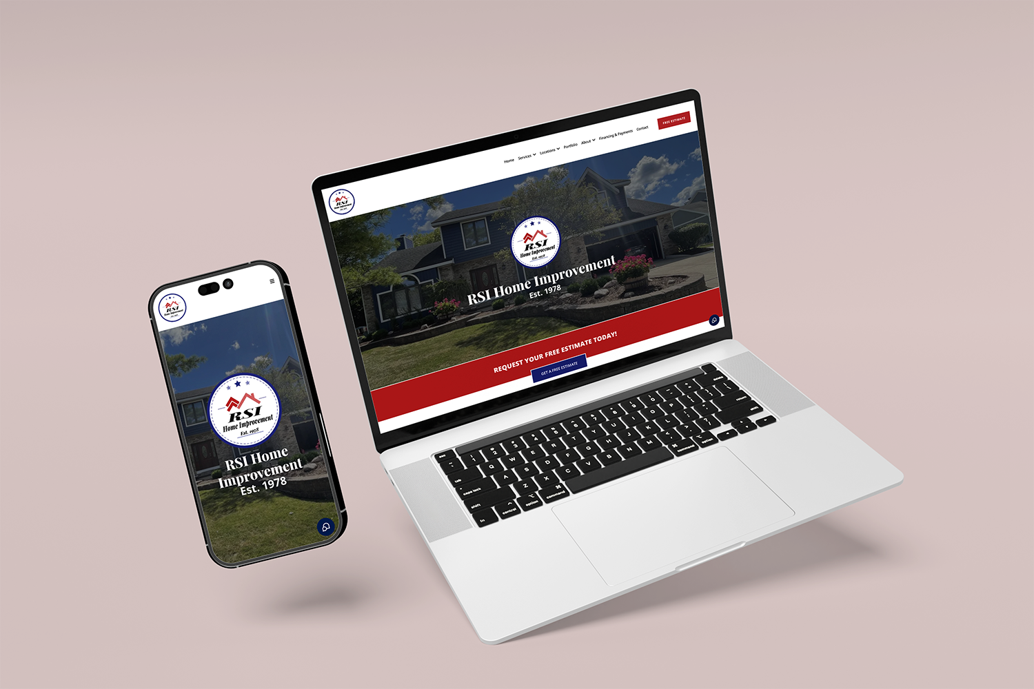
Here’s a number worth sitting with: across most industries, well over half of website traffic now comes from mobile devices, and for many local businesses, it’s closer to 70%. That means the majority of people discovering your business are doing it on a phone, often while multitasking, standing in line, or searching on the go.
Now here’s the uncomfortable follow-up question: does your website actually work well on a phone? Not just “technically loads,” but genuinely easy to read, navigate, and act on?
What “Non-Responsive” Actually Means
A responsive website automatically adjusts its layout, text size, images, and navigation based on the device it’s being viewed on. A non-responsive (or poorly optimized) website was often built primarily for desktop, and simply shrinks everything down on mobile, resulting in tiny text, awkward navigation menus, images that don’t fit the screen, and buttons that are nearly impossible to tap accurately.
If a visitor has to pinch, zoom, and scroll sideways just to read your homepage, you’ve already lost a meaningful percentage of them. And they won’t tell you why. They’ll just leave.
Why This Costs You More Than You’d Think
- First impressions happen fast. Studies consistently show people form an opinion about a website within seconds. A clunky mobile experience signals “outdated” or “unprofessional” almost instantly, even if your actual business is neither.
- Google penalizes non-mobile-friendly sites. Google has used mobile-first indexing for years, meaning it primarily evaluates the mobile version of your site for search rankings. A poor mobile experience can directly hurt your visibility in search results.
- Higher bounce rates. Visitors who struggle to use a site on mobile leave quickly, and high bounce rates can further signal to search engines that your site isn’t a good result to show people.
- Lost conversions. Whether the goal is a phone call, a form submission, or an online purchase, every extra bit of friction on mobile reduces the odds someone follows through.
- Lost trust. For many customers, a business’s website is their first real interaction with the brand. A broken or frustrating mobile experience raises doubts about the quality of the business itself, fair or not.
What a Truly Mobile-Optimized Site Looks Like
- Fast load times, since mobile users are often on the go and less patient with delays
- Thumb-friendly navigation, with buttons and menus sized and spaced for tapping, not clicking
- Readable text without zooming, using font sizes and spacing designed for smaller screens
- Simplified layouts, prioritizing the most important information and actions first
- Click-to-call buttons, making it effortless for a mobile visitor to reach you directly
- Forms built for mobile, with minimal fields and mobile-friendly input types
This Isn’t a “Someday” Fix
If a majority of your traffic is mobile and your site isn’t built to serve them well, that’s not a small technical detail, it’s actively undermining your marketing, your ad spend, and your search visibility every single day it goes unaddressed.
The good news: this is one of the more straightforward things to fix with the right team, and the return on fixing it tends to show up quickly, since you’re not generating more traffic, you’re just finally converting the traffic you already have.